uMoncton – Institutional brochure Moncton 2010 games
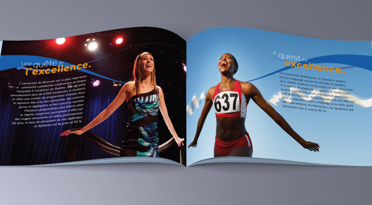
In 2010, the Université de Moncton was the host of the IIHF World Track and Field Championships. As the eyes of the world were to be on them, they wanted to develop a brochure that promoted the Université both from the academic side as well as the athletic side. I’ve always liked symmetry, using different elements in similar ways. For this concept, I found places where I could create images that would mirror themselves, one representing athletics, one a strength of the university. As the brochure would be produced in both official languages, that also added to the mirror effect, each page of the spread with the same text in a different language. The title, A Reflection of our Strengths, came naturally. We also used a spot varnish and metallic ink special effects to enhance the blue lines and gold text.
Read More ›
uMoncton – Guide de renseignements généraux 2018
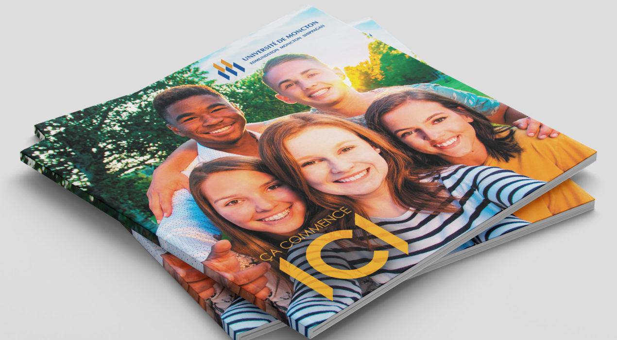
For 2018’s uMoncton Viewbook (or in French — Guide de renseignements généraux) we really wanted to capture the Université de Moncton’s warm, friendly and personalized atmosphere. We wanted colourful, with large images that really convey what life at uMoncton is all about, all while communicating all the necessary information for admissions and scholarships.
Read More ›
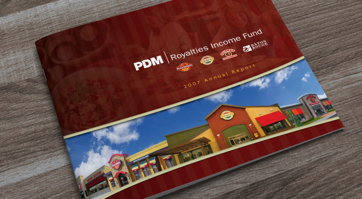
PDM Royalties Income Fund 2017 Annual Report
PDM Royalties Income Fund is the entity that manages the operations of four restaurant chains in Canada and the US. Annual reports are all graphs and text, but I love finding interesting ways to present them. This was my third year designing their Annual Report. The client supplied all the photography, coupling mouth-watering food shots with a side-dish of good numbers. The subtle use of vertical stripes on a horizontal page gives this report a real homestyle feel.
Read More ›
