Holiday card – A gift for you
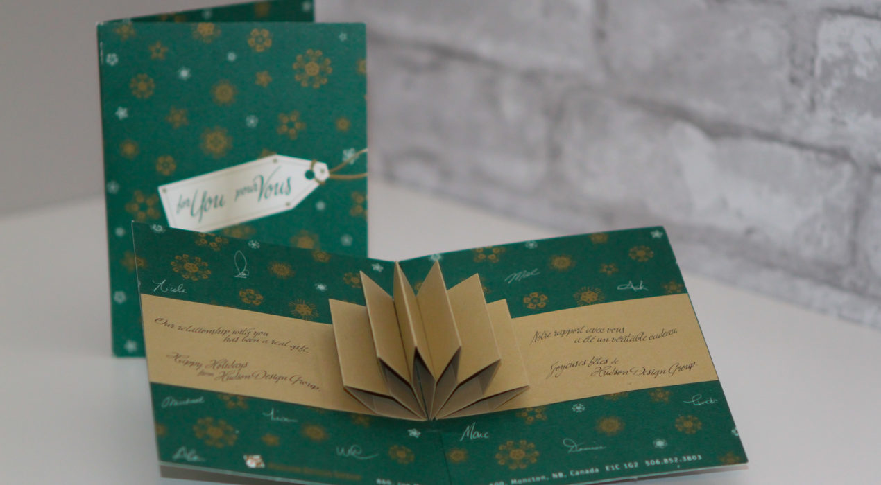
This card was a fun project during my time at Hudson Design Group. The outside of the card looks like a wrapped gift with a tag that says “For You” on the tag. The wrapping paper is comprised of stylistic uses of the Hudson Design Group hand to make snowflake-like patterns. Upon opening, a small bit of paper engineering makes a pop-up bow and a ribbon that reads “Our relationship with you has been a real gift”.
Read More ›

Hudson Design Group – Reindeer Games
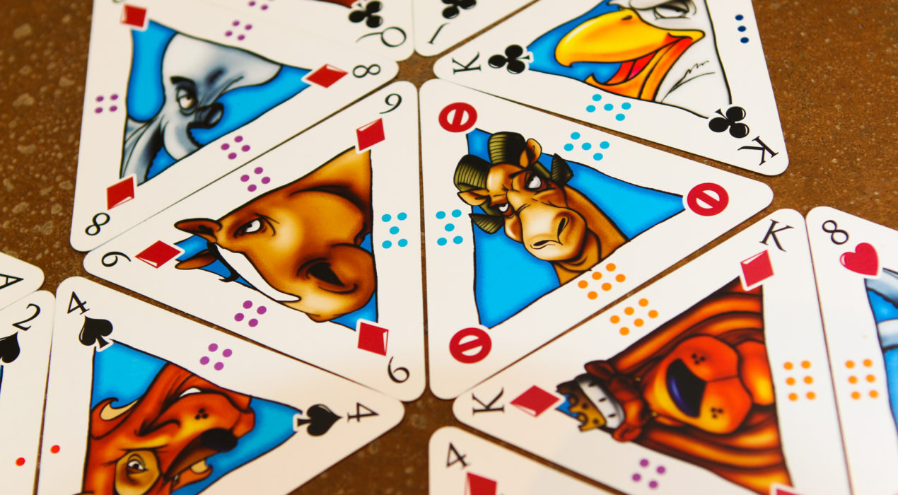
Hudson Design Group Design: André Goguen, Michael McCabe, Jocelyne Saulnier, Richard Osbourne Illustration: Michael McCabe Hudson Design always had creative christmas cards, and for its 20th anniversary, we wanted to have something extra special. So instead of a christmas card, we sent a deck of cards, but with a twist. This consisted of a deck of 60 cards, with a triangular shape, with different symbols on the sides. It had the 52 standard cards, as well as “super-trump” rock, paper, scissors cards and “pass” cards. The symbols on the sides of the cards could be used to play “Hexcentric” a game we devised that consists of matching the colours and symbols on the sides of the cards to make hexes to score points. There were also two of each illustration so kids could play a memory game. My contribution to the project, in addition to suggesting the initial idea, was creating the suit symbols, designing the box die and artwork, and coming up with the Hexcentric game. As these were hand-delivered to local clients, the best thing was when it was delivered to radio personailites while they were on air and they raved about the creativity during their show.
Read More ›
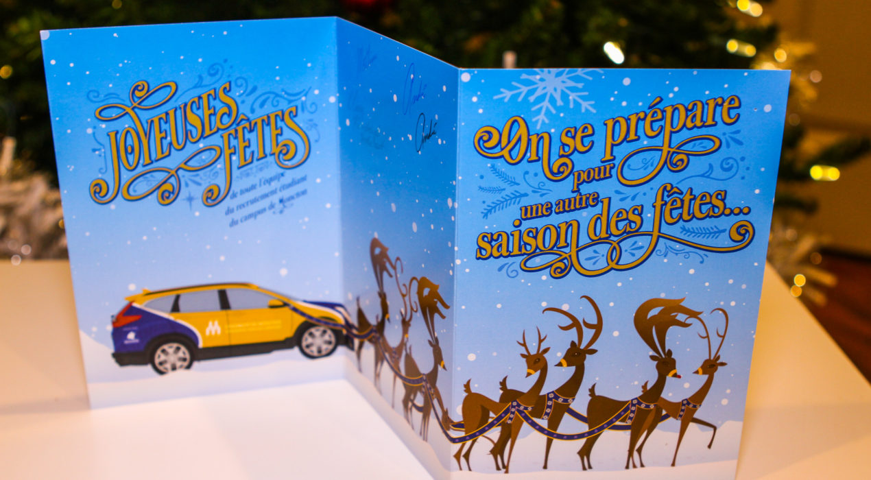
uMoncton holiday card – Shiny Tree
Since all the printed materials for Université de Moncton had been in square format, we continued to use it for this card. The front graphic is a stylized Christmas tree using the shape found in the uMoncton logo, with said logo as a tree topper. Stylized lights adorn the background to give it a Christmas tree feel. I used a soft-touch lamination with spot high-gloss 3D varnish to make the logo elements stand out both visually and in a tactile manner. I really enjoyed the holiday font usage on the interior with the words “Joyeuses Fêtes” (Happy holidays). Each card was individually signed by the entire team. The back of the card shows the same logo that appears on the hoodies given to new applicants to the Université.
Read More ›
