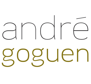
Magik Traktor Games logo
To create this logo for a small independent board game company, I really wanted to convey FUN. By playing with Colors and the shapes of the letters, I managed to create the shape of a tractor — sorry, traktor — and gave it wheels by extending and curving the descending lines of the Rs and adding treads. Add a star to the smokestack and you get some magik. I gave it a bit of a slant to imply movement. I really find you see all the parts, the cab, the engine, the wheels, and it looks like a fun ride.
Read More ›
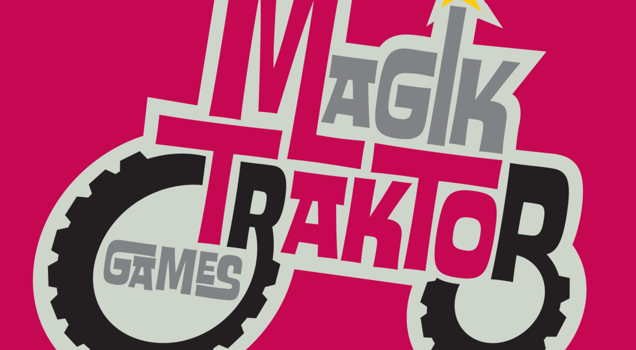
All-Around Construction & Repair logo
This logo was designed for a family friend who was starting up his own construction and repair company. He had settled on the name “All-Around” since he was a jack of all trades capable of building or fixing pretty much anything, and did very good work. I felt when it came to construction, the biggest factor of quality was if it was built right, which means is it level. So I incorporated the vial of a level as the horizontal bar of two As, representing the outside and inside of a home. I also incorporated a circular arrow in the O in the name to drive home the “All-Around” part of the name.
Read More ›
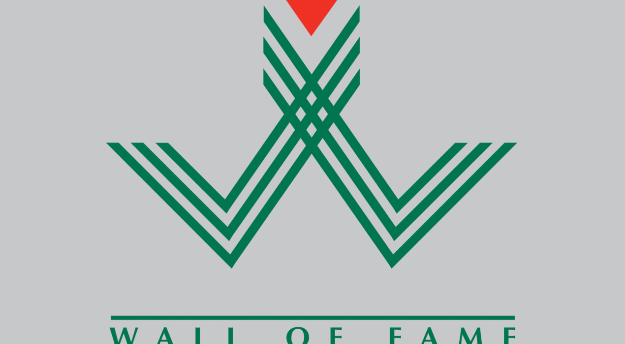
Sports Moncton Wall of Fame logo
The Sports Moncton Wall of Fame is Greater Moncton’s premier honor for athletes and builders in the region’s sporting circles. The goal was to make a logo that respected that honor. I was inspired by the Montreal 1976 olympics imagery when I created this logo. The shape recalls a W, and the two shapes coming together can represent the french and english communities of greater Moncton coming together to light the flame of sports.
Read More ›
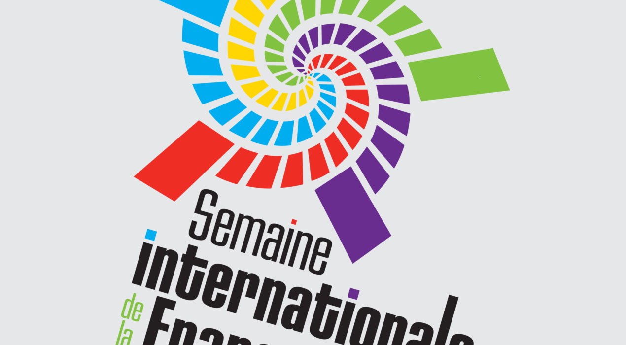
Semaine internationale de la francophonie logo
When the Université de Moncton wanted revamp their international week (semaine internationale) that celebrates the International students and their cultures, they wanted to create a new identity as well. They were tying in their activities with the Organisation Internationale de la francophnie (OIF) so wanted to tie-in the logo to their colours. The shape I created can recall many things, firstly, there is a vaguely human shape, garbed in a robe of many colours, which can represent the vibrant clothing and traditions of many cultures. You can also see a star, which is a symbol of the Université’s acadian culture. Lastly, all the coloured spirals are meeting in the center, which represents different cultures coming together.
Read More ›
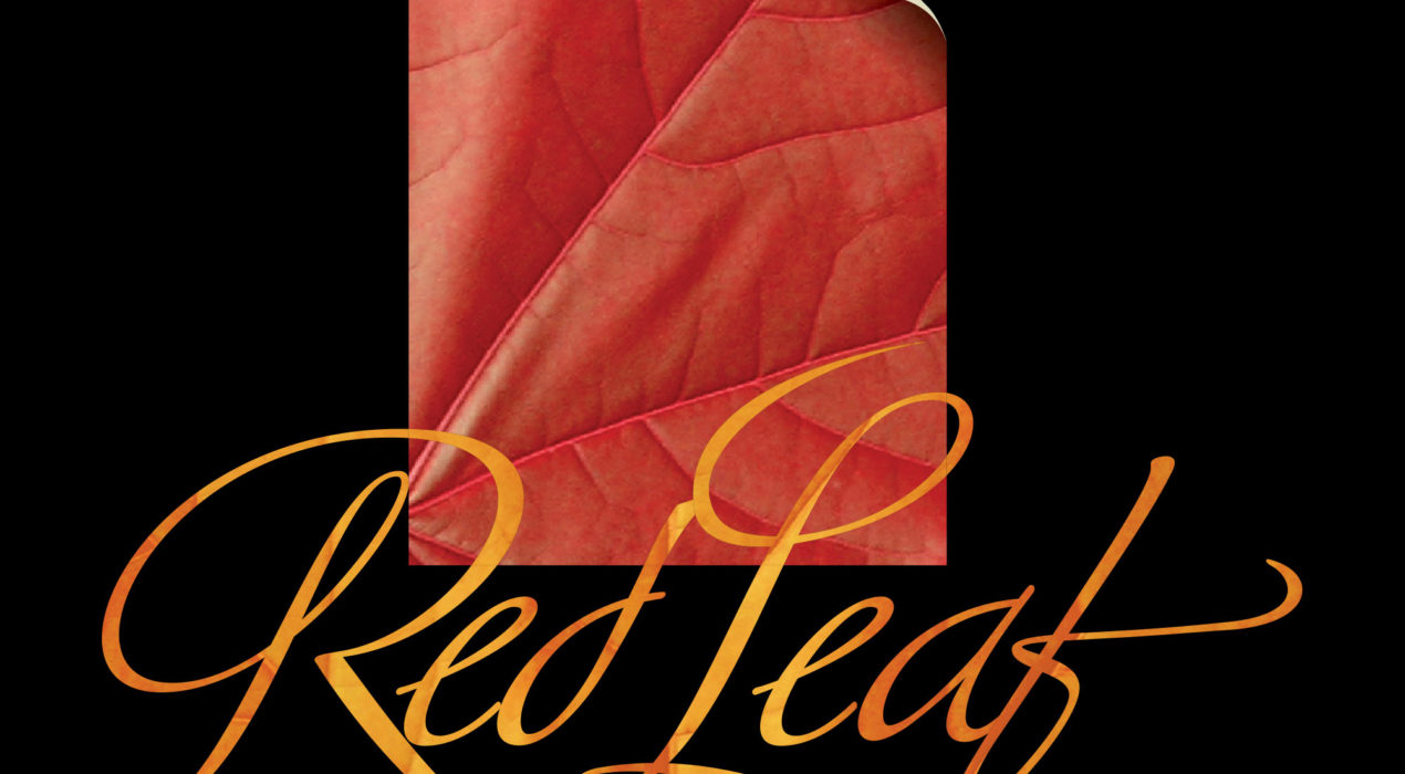
Red Leaf Productions logo
This independant Film company wanted to focus on two aspects with their image, they wanted to emphasize they were writers, and they were Canadian. Using the red leaf (recalling the canadian maple leaf) as a sheet of paper, with the corner curling to reveal the white page beneath, really combined those two messages. Plus I was able to animate it for the opening bug.
Read More ›
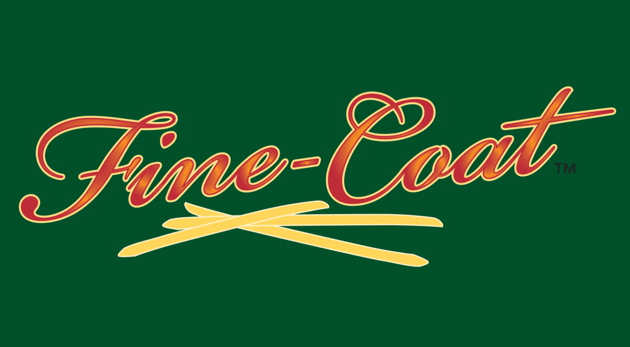
Cavendish Farms Fine-Coat fries logo
Cavendish Fams new Fine-Coat fries were, at the time of their launch, an innovation in french fry coating technology. A very fine coating keeps the fries crisp a long time, while maintaining the flavour of an uncoated fry. The product is geared towards a more high-end clientele. The thin lettering surrounded by a thin outline conveys these qualities.
Read More ›