Holiday card – A gift for you
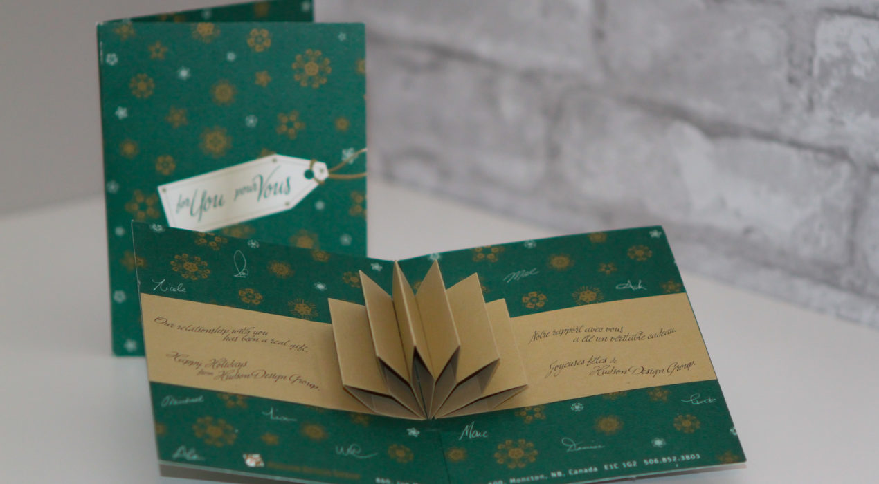
This card was a fun project during my time at Hudson Design Group. The outside of the card looks like a wrapped gift with a tag that says “For You” on the tag. The wrapping paper is comprised of stylistic uses of the Hudson Design Group hand to make snowflake-like patterns. Upon opening, a small bit of paper engineering makes a pop-up bow and a ribbon that reads “Our relationship with you has been a real gift”.
Read More ›
uMoncton – Institutional brochure Moncton 2010 games
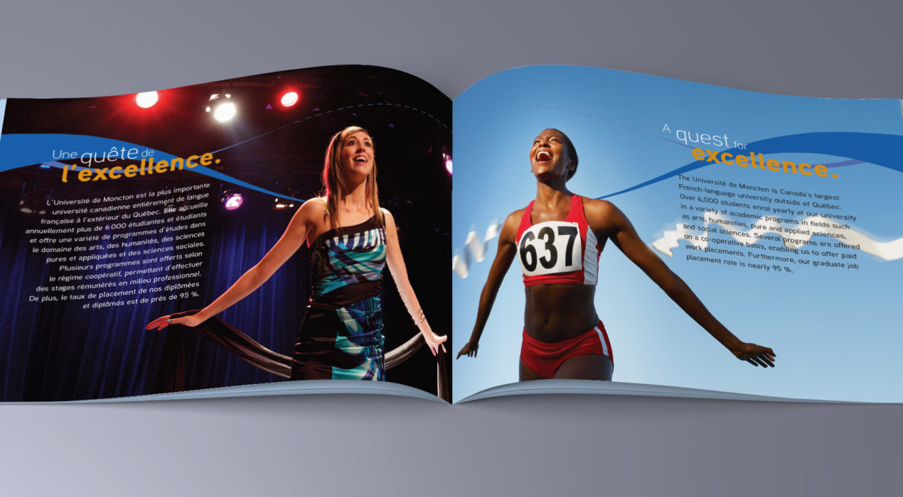
In 2010, the Université de Moncton was the host of the IIHF World Track and Field Championships. As the eyes of the world were to be on them, they wanted to develop a brochure that promoted the Université both from the academic side as well as the athletic side. I’ve always liked symmetry, using different elements in similar ways. For this concept, I found places where I could create images that would mirror themselves, one representing athletics, one a strength of the university. As the brochure would be produced in both official languages, that also added to the mirror effect, each page of the spread with the same text in a different language. The title, A Reflection of our Strengths, came naturally. We also used a spot varnish and metallic ink special effects to enhance the blue lines and gold text.
Read More ›
uMoncton – Guide de renseignements généraux 2018
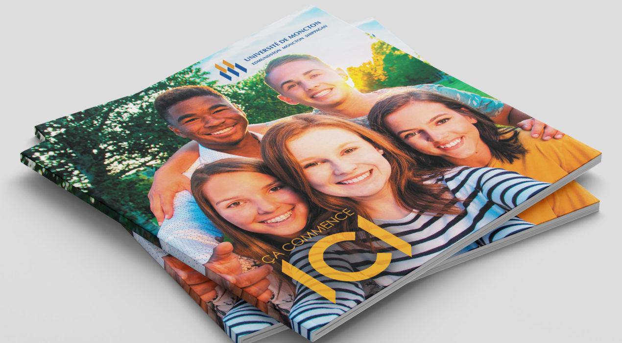
For 2018’s uMoncton Viewbook (or in French — Guide de renseignements généraux) we really wanted to capture the Université de Moncton’s warm, friendly and personalized atmosphere. We wanted colourful, with large images that really convey what life at uMoncton is all about, all while communicating all the necessary information for admissions and scholarships.
Read More ›
NB Power Gift Cards
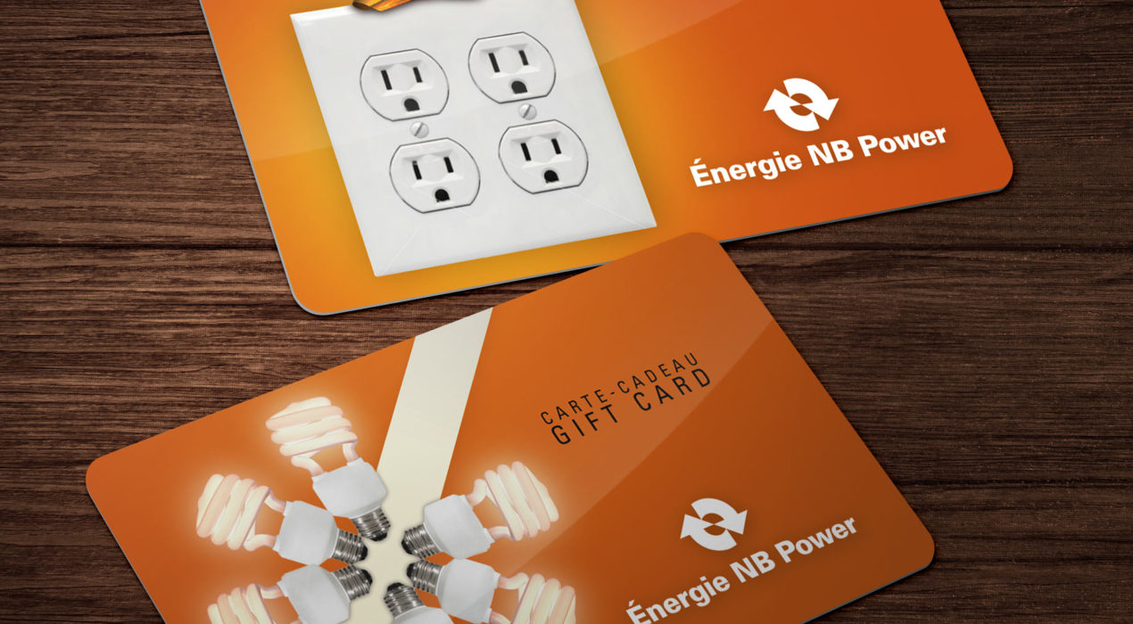
I was really proud of this simple yet creative use of electricity-related elements to create gift imagery. It communicates the message in a fun whimsical way.
Read More ›
Owl River Runners movie poster
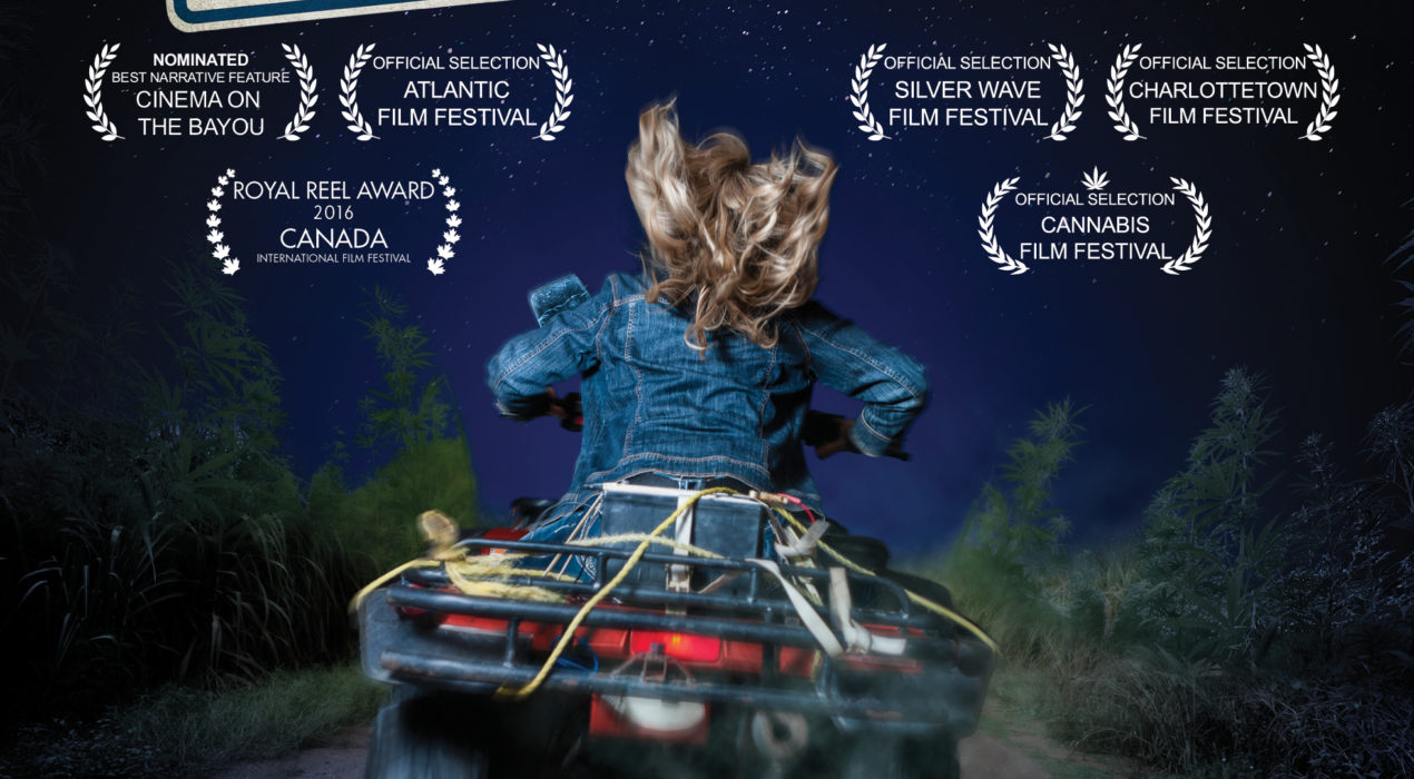
Photography: Marc Grandmaison Owl River Runners is a movie about a young girl, Jamie, that feels trapped in the small town of Owl River. The only thing I knew about the story when I was tasked to create the poster was that it involved a secret marijuana field and that she enjoyed “borrowing” a local farmer’s four-wheeler to take joyrides around the back roads. So that’s what I worked with. We did a photoshoot in a friend’s garage and I went to work to create the poster.
Read More ›
PDM Royalties Income Fund 2017 Annual Report
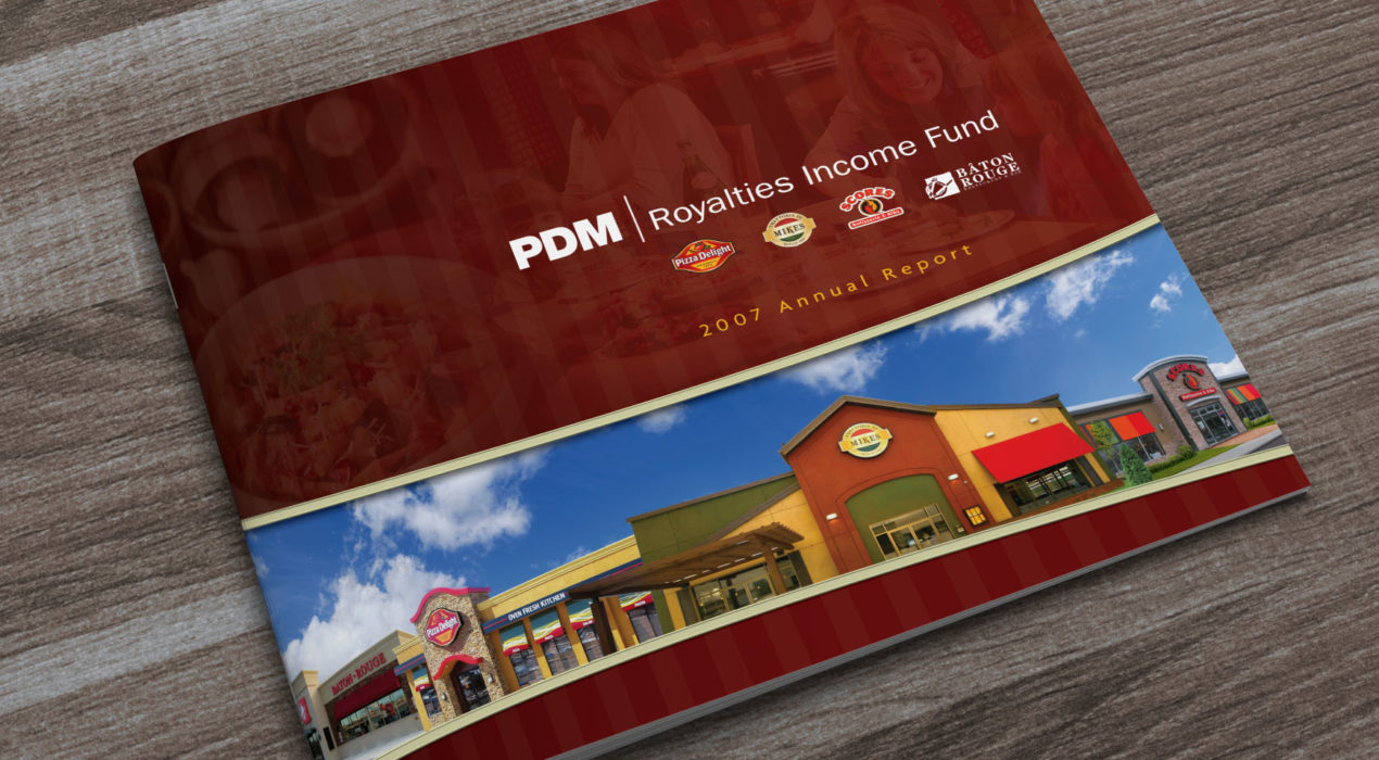
PDM Royalties Income Fund is the entity that manages the operations of four restaurant chains in Canada and the US. Annual reports are all graphs and text, but I love finding interesting ways to present them. This was my third year designing their Annual Report. The client supplied all the photography, coupling mouth-watering food shots with a side-dish of good numbers. The subtle use of vertical stripes on a horizontal page gives this report a real homestyle feel.
Read More ›
Rulers of Aeternus
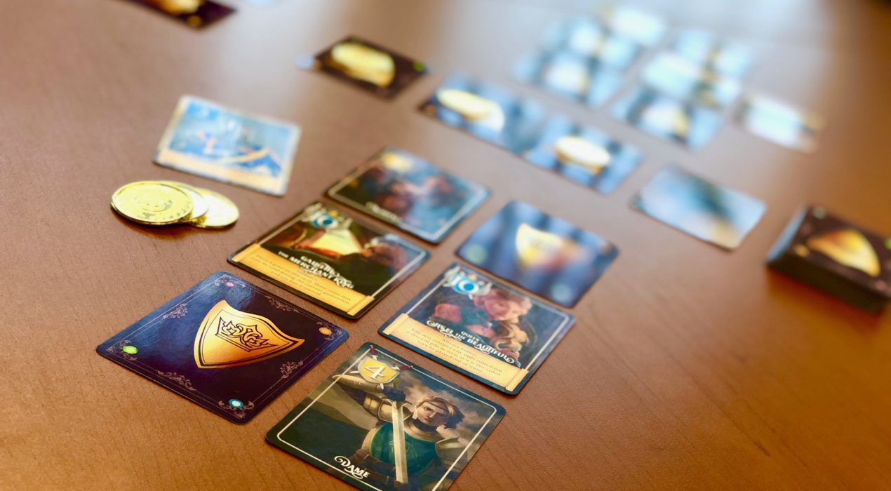
Game design and graphic design: André Goguen Illustrations: Janelle Bourque This is a card game I designed and am currently playtesting with hopes of running a kickstarter to produce. It is a card-drafting game loosely based on the traditional card game Golf, where the goal is to ensure that side-by-side “nations” in your realm are led by rulers of a similar might in order to create as little unrest as possible.
Read More ›
The Bannisters movie poster
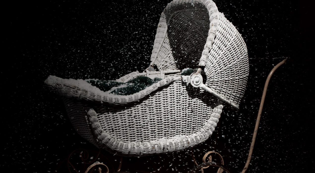
The Bannisters was a film about the last execution to take place in New Brunswick, and the crime that led to it. The Bannister matriarch used to travel the town with a baby carriage, usually with a doll inside, to make it seem as if she had recently given had a child. The photo was taken with the original movie prop and with simulated snow.
Read More ›
uMoncton holiday card – Shiny Tree
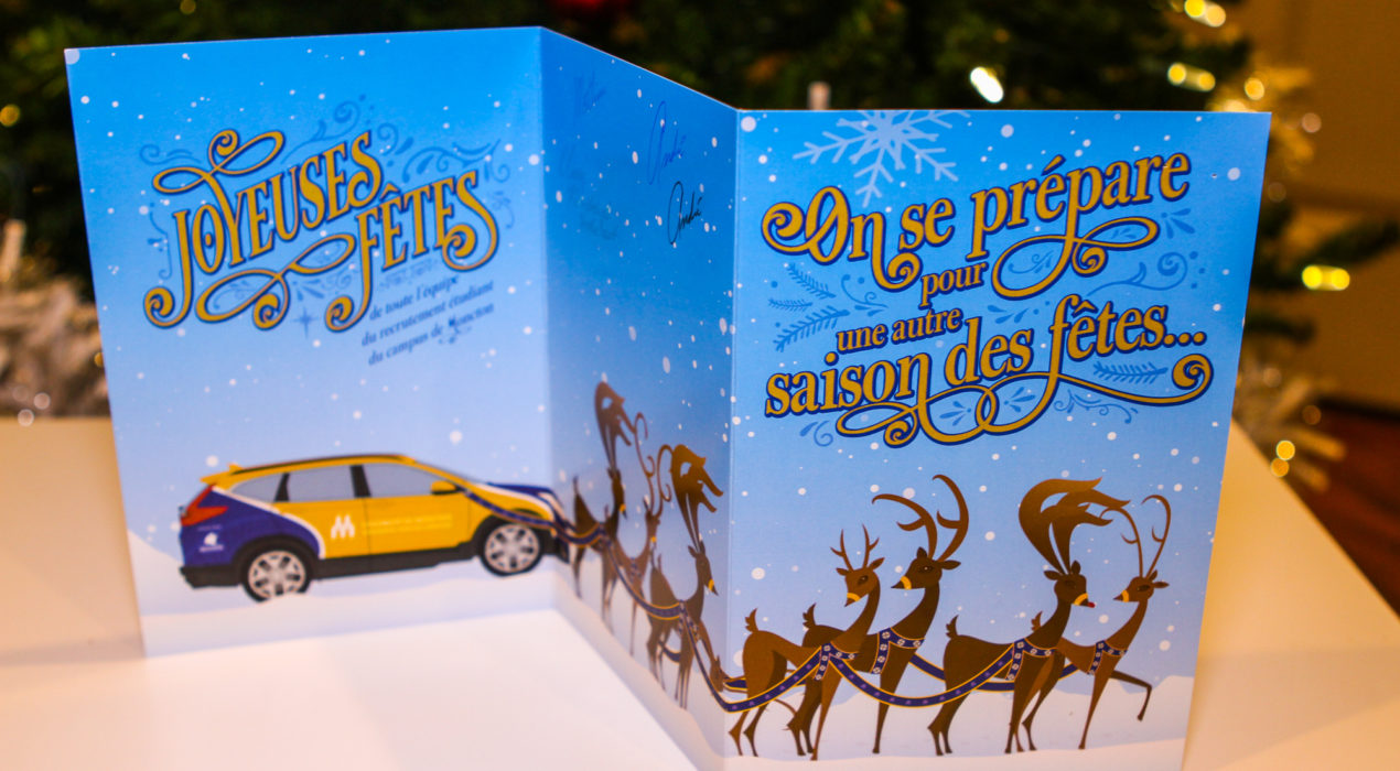
Since all the printed materials for Université de Moncton had been in square format, we continued to use it for this card. The front graphic is a stylized Christmas tree using the shape found in the uMoncton logo, with said logo as a tree topper. Stylized lights adorn the background to give it a Christmas tree feel. I used a soft-touch lamination with spot high-gloss 3D varnish to make the logo elements stand out both visually and in a tactile manner. I really enjoyed the holiday font usage on the interior with the words “Joyeuses Fêtes” (Happy holidays). Each card was individually signed by the entire team. The back of the card shows the same logo that appears on the hoodies given to new applicants to the Université.
Read More ›
